
Grid-based design
Grids have always played a role in web design, but this map or grid style has become increasingly popular over time. This flexible layout is a popular option for large contents pages (e.g. Pinterest), lists and photo galleries (e.g. Instagram) as it looks good on any size screen. Responsive web design in particular benefits from this style. Web content can be scaled or reordered using this grid system.
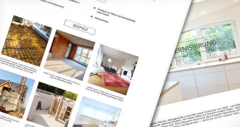
Example: Bauwerk
Personal branding
Personal branding exists, whether you choose to acknowledge it or not. The identity of a person or a brand and the image as it is perceived by other people can be very different. The aim should therefore be to present your vision and mission so that they are perceived as you would like them to be.
“Your brand is what people say about you when you’re not in the room” – Jeff Bezos, Founder of Amazon
If there is a person behind a company, trademark or organization, people are more likely to trust them and make (purchasing) decisions. A personal photo along with a large number of followers provides proof that the person or brand is worth following.
The Complete Guide to Building Your Personal Brand
Mobile First Websites
You cannot ignore the statistics: Today, every third visitor to a website is using a mobile device. And visitors to websites may not stick around as long if the site is not optimized for mobile phones. When designing or redesigning a website, it is therefore important to consider the mobile-friendly aspect of the site in order to maximize potential and to better reach the target group. The content should be brief and take advantage of the benefits of advanced features like GPS, touchscreen etc.