
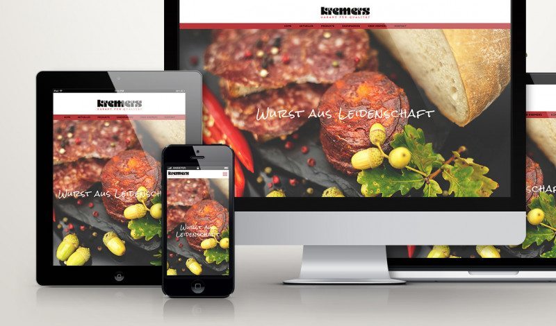
Responsive web design has become increasingly important in the age of smartphones and tablets. More and more users are browsing websites using mobile devices. Nowadays, the graphic design of a website must be compatible with the device used to view it. To achieve this, individual elements must be specially adapted, such as the navigation, sidebars and text. The screen size is then automatically recognized and the web content adapted accordingly. This ensures that the user has the best possible user experience, regardless of the screen size or device used to visit the website. Intelligent responsive websites are easier to read on small screens because the text size automatically adjusts to the screen size and is optimally positioned on the small screen. The navigation menu is usually displayed as a special icon—the Hamburger , which looks like the well-known meat sandwich—in order to allow space for the content and provide a clutter-free overview.
Content flow
Since screens on mobile devices are smaller, content now has to be distributed vertically. A single-column layout is significantly longer than a two or three-column layout on a wider screen, so the mobile version requires some special adjustments.
Relative units of size
Whether on a desktop computer or a mobile phone screen, all content has to be flexible because screen resolutions can vary dramatically between devices nowadays. And that is where relative units such percentages come into play. That way, rather than an image being 1200 pixels for example, it is always 50% as wide as the relevant screen resolution instead.
Web fonts vs system fonts
If you want to use a specific font on a website, you will need to use a web font such as one of the Google web fonts. However, you should bear in mind that these fonts will have to be downloaded each time the website is loaded and will increase the time that your website takes to load. System fonts (such as Arial), by contrast, load instantly.
Tip: Our colleagues at Froont have illustrated the most important responsive design principles on their website, along with easy-to-understand animations. As you can see, there are many basic principles to consider and a traditional website will need to be relatively extensively rebuilt. However, this is beneficial not only to visitors but also when it comes to indexing in search engines…
Search engines
Ultimately, an optimized website not only increases the length of time that mobile visitors spend on it but also makes the content in the search engine more relevant. Search engines rate responsive websites more highly than traditional websites that only support large screens.